Analyzing Honey Production Trends with Python
-
0 sales
- 14 views
- Save
0 /5.0
User review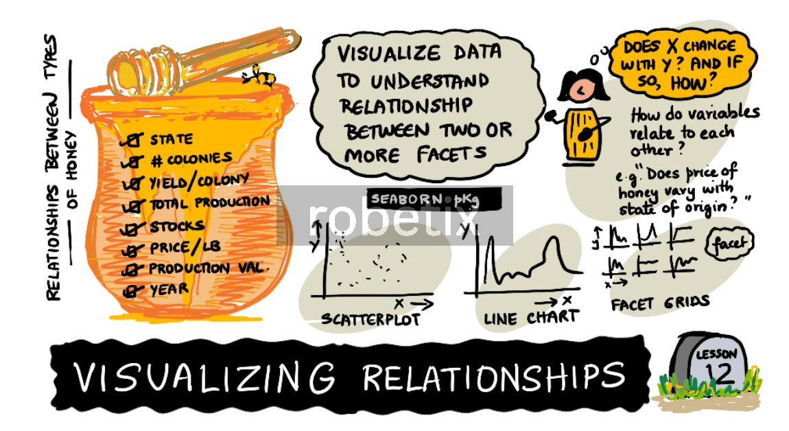
If you have ever stared at a massive spreadsheet and wondered how to make sense of it, this project is a perfect starting point. Originally developed as part of Microsoft's Data Science curriculum, it uses 14 years of US agricultural data to explore the real-world impact of Colony Collapse Disorder on honey bees.
Instead of getting bogged down in complicated statistics, you will learn how to use Python's Seaborn and Matplotlib libraries to tell a clear story with your data. You will work with roughly 600 records covering colony counts, honey yields, and pricing and turn them into clean, multi-dimensional charts.
One of the best takeaways from this project is learning how to use dual-axis plotting. You will layer different metrics over each other to reveal hidden trends like the surprising fact that honey yields dropped even when the total number of bee colonies seemed stable. The project also covers practical design standards such as using size and shape instead of just color to make sure your visualizations are accessible to colorblind users. This is a highly practical, visual introduction to exploratory data analysis.
Fequently asked questions
What Python libraries do I need to know for this?
You will primarily be working with Pandas to load and clean the raw data and Seaborn alongside Matplotlib to draw and style the graphs.